

When the owners of Herb the Barber came to us, they had one clear ask: make it feel like a real barbershop, not another generic salon logo. No soft gradients, no thin minimalist script something with weight, something that belonged on a window sign in etched gold leaf.
That’s a harder brief than it sounds. “Make it look classic” usually ends up meaning “make it look dated” if you’re not careful, and the barbershop world is full of logos that lean so hard into vintage that they read as costume rather than craft. The real challenge wasn’t finding an old-timey look. It was finding one that felt earned.
It also mattered more than a logo usually does for a business this size. Herb the Barber didn’t have an existing customer base to fall back on while the brand caught up; this was a brand-new shop, opening in a neighborhood with three other barbershops already established. The identity wasn’t decoration on top of the business. For the first few months, it was doing a lot of the convincing on its own, before a single haircut ever proved the shop’s quality.
Starting With What Already Works
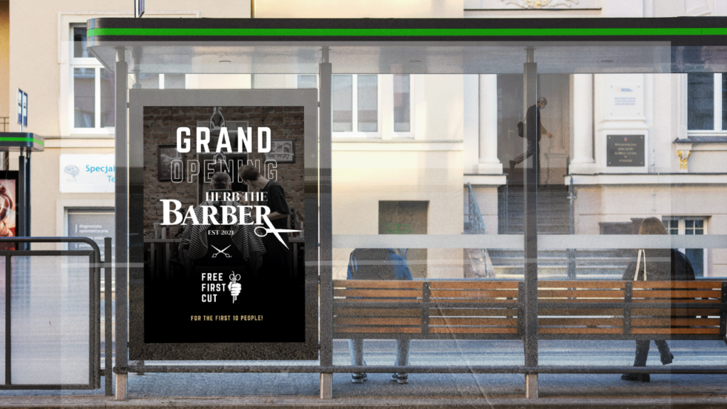
Barbershop iconography has been around for over a century, and for good reason: scissors, razors, and shop badges are instantly recognizable. Rather than reinvent that visual language, we leaned into it. We pulled references from vintage shop signage, boxing gyms, and old union badges anything with hand-cut, high-contrast confidence to it.
The early sketches explored a dozen directions: a monogram-only mark, an illustrated straight razor, a full badge crest. The badge format won out fast; it gave us a shape that could work as a full sign, a small social avatar, and a single-color stamp on packaging, all without losing legibility.
A few directions got ruled out just as fast. An illustrated straight-razor mark looked great as a single large image but fell apart at small sizes at social-avatar scale; it turned into an unreadable smear of thin lines. A monogram-only approach was clean but generic; it could have belonged to almost any barbershop in the country, and “could belong to anyone” is the opposite of what this brand needed. The badge format survived because it was the only direction flexible enough to stay legible at every size it would actually be used at, from a six-inch business card to a six-foot storefront window.
“The goal wasn’t to look old. It was to look like it was never going anywhere.”
From Start to Finish: Inside the Process
Every brand identity project runs on roughly the same skeleton, and this one was no different. Here’s what the four weeks actually looked like, from start to finish.
Week 1 — Discovery. Before a single sketch happens, it’s a conversation. What does the shop actually feel like when you walk in? Who’s the regular customer? What existing brands, barbershops, or otherwise do they point to and say “that, but for us”? This is also where the boundaries get set: what colors are off the table, what’s already on the shop’s awning that can’t change, what the owners have tried before and hated.
Week 2 — Research and Concepts. This is the moodboarding phase, pulling references from vintage signage, old badges, and shop lettering, followed by sketching. We don’t show a client one polished option; we present two or three genuinely different directions, so the choice is about which direction feels right, not about picking apart a single idea.
Week 3 — Refinement. Once a direction is chosen, it’s rebuilt from scratch at a higher level of craft: real typography instead of rough placeholder type, actual line weights, real color. This is also where we stress-test it: does it still read at business-card size? Does it hold up in one color? Does it look right stitched on a hat versus painted six feet wide on a window?
Week 4 — Final Delivery. The last step is the unglamorous but critical one: packaging everything up. That means the primary mark, simplified/alternate versions for small applications, a basic color and type guide, and every file format the client will actually need print-ready, web-ready, and social-ready.
It’s worth saying that these four weeks weren’t spent in isolation. The owners saw work at the end of every phase, not just at the very end, which is intentional. A client finding out in week four that the direction feels wrong is a failure of the process, not the client’s fault. Checking in at each phase means nothing that reaches final delivery is a surprise
Type, Color, and the Final Mark
For type, we paired a bold serif for “Herb the Barber” with a clean, spaced-out sans for the supporting badge text “Est. 2021” and “Fresh Cuts.” That contrast does a lot of the heavy lifting: the serif carries tradition, the sans keeps it from feeling costume-y.
Color stayed intentionally restrained: rich black, a warm off-white, and a single deep red used sparingly, just enough to feel sharp without tipping into “loud.” The final logo reads clean at business-card size and holds up just as well painted six feet wide on a shop window.
Every version of the mark got tested the same unglamorous way: printed small, viewed from across a room, converted to pure black and white, and squinted at on a phone screen at 3 am brightness. A logo that only looks good in a clean, full-color mockup isn’t finished; it’s just untested. By the time this one shipped, it had survived all of that without losing any of its shape or legibility.
How Naidu Designs Transformed Herb the Barber’s Brand
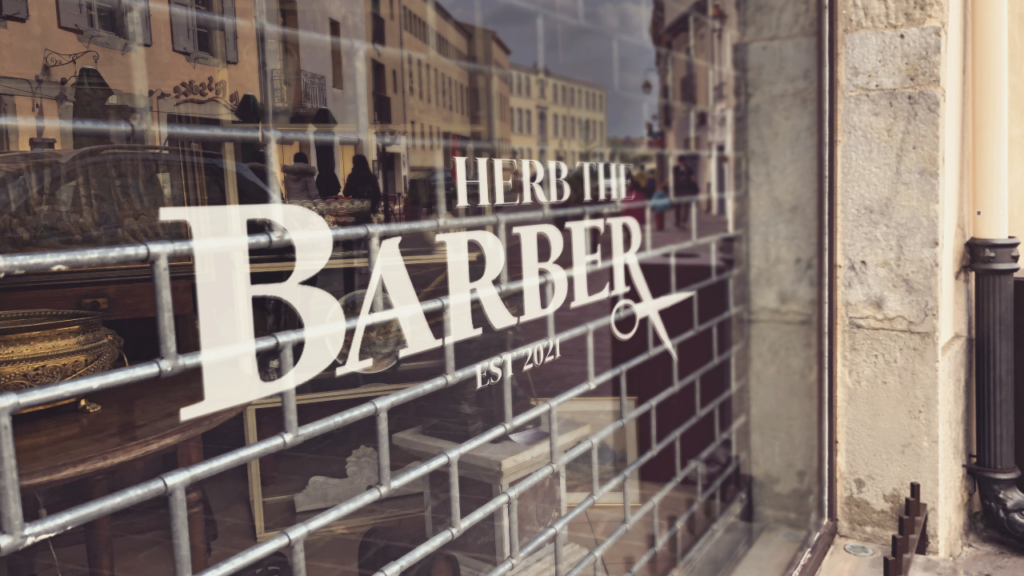
Before this project, Herb the Barber’s visual identity was scattered: a different look on the storefront sign than on the Instagram page, a different look again on business cards printed in a rush before opening day. None of it was wrong exactly; it just didn’t add up to one recognizable thing.
What changed wasn’t just the logo itself; it was giving the shop a single adaptable system it could carry everywhere. The same badge now shows up identically on the window, the social avatar, the appointment reminder cards, and the hot towel warmers behind the chairs. That consistency is what makes a small, independent shop start to feel like an established one not louder marketing, just one mark doing its job everywhere it appears.
There’s a practical side to this too, beyond how it looks. Because all signage, packaging, and social templates now come from one set of brand files instead of being recreated from scratch each time, the owners can hand a single folder to a sign shop, a printer, or a new hire and know exactly what they’ll get back. That’s the quieter, less exciting half of what a real brand identity does: it saves a small business from re-solving the same design problem every single time something new needs to be made.
It’s exactly what a good brand mark should do: disappear into the background of daily life until the moment you actually look at it, and then it tells you everything about the place in half a second.
